Each website owner wants their business website to Impact the market strongly. And to do so your web design needs to be Engaging. Who wants a boring business website? Of course no one does.
Well, most of the people strive to get a good Website Design for their business.
To be honest, there is no Rocket Science in making an Impactful business website and it’s not that simple too. You simply need to make some Changes to your Website Design and there you go.
In this Article we’ll share with you; 5 Ways to Create an Impactful Business Website. We’ll be going deep on every single factor that matters in your website. And I am sure if you follow these 5 tips you can definitely build a strong layout in your web design.
Add Video To Your Business Website:
We humans have only three ways of communication, Textual word, Audio and Video. And Guess what creates the most Engagement? Yes, it’s Video. A video is always considered the best way to communicate with any person online.
But why should you add a Video to your Website’s Design and how would it help?
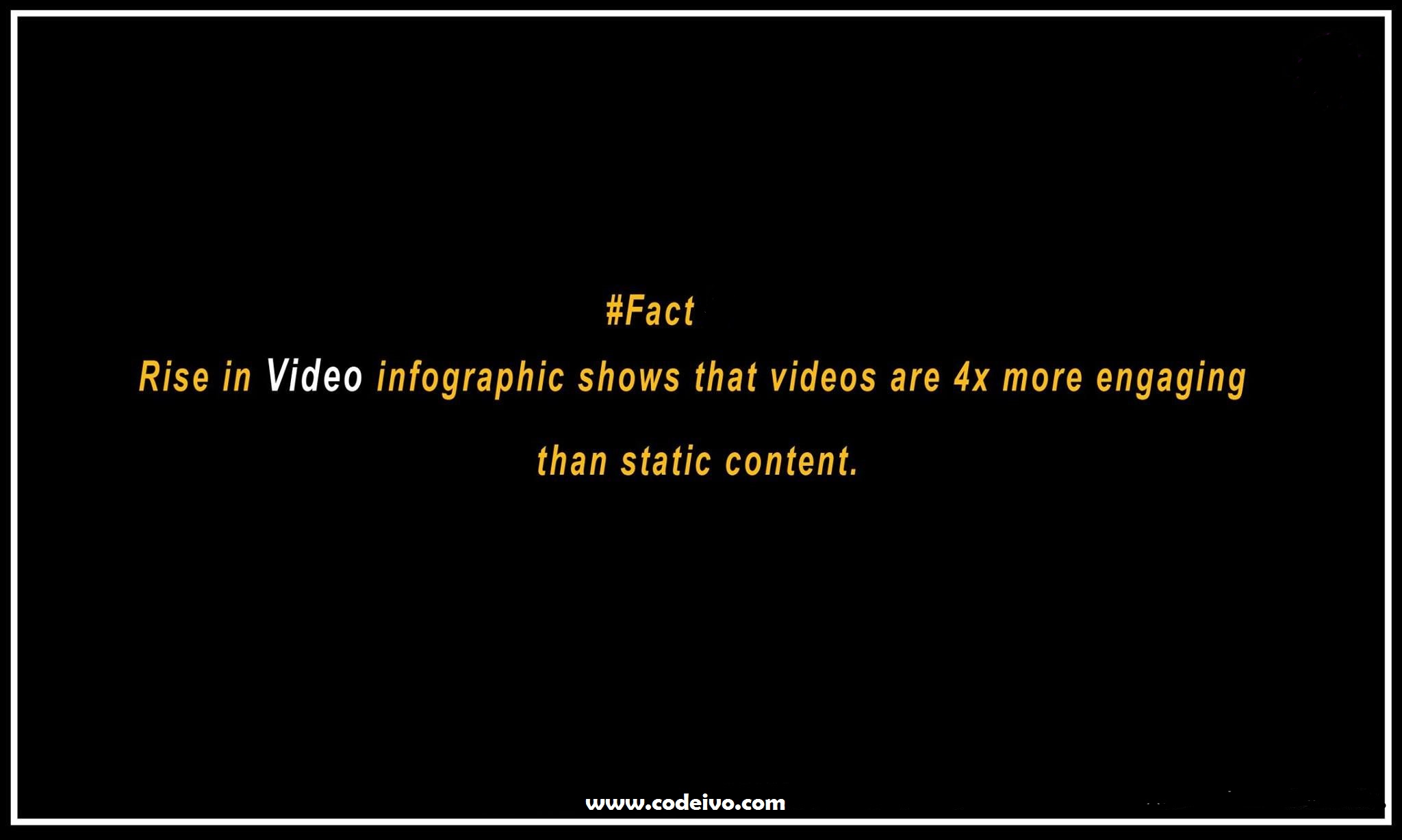
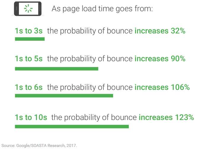
Here’s why; have a look at the picture below, sharing some statistics about “Videos”
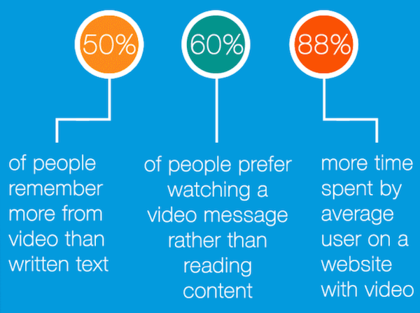
These stats are showing the worth of Video content by themselves.
Now it is undoubtedly clear that adding some Videos to your website design will definitely help in your Website being more effective, but the question that arises now is;
How should you put a Video to your Website?
Some of the basic things for the Video which cannot be ignored are which are;
- Audio Quality should be good.
- The Content should be “to the point” and binary.
- It should be relevant to your specific Niche.
Afterwards pay close attention to these points;
How should the Video be for Your Business Website?
Length:
The Length shouldn’t be too long. The attention span of an average visitor on your website is very short. Yes, your Video will make your user attentive for some time and it may generate some curiosity in him but it won’t last too long.
The average recommended length for this Video is no more than 1.5 minute. Try to cover everything within that.
Story telling:
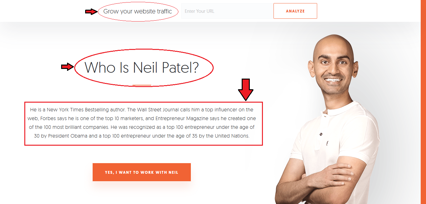
You are using this Video on your website to tell a story to your visitor. Most of the time, it’s made for the Intro of who you are and what you do etc. For example look at the Web page of Neil Patel Website;
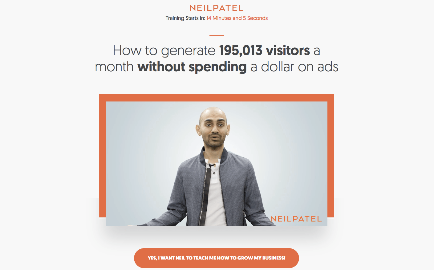
In this case Neil Patel has put in the Video on his website’s homepage which tries to get the attention of the Visitor as soon as it enters the website.
Format and Optimization:
Research has shown that the Videos that get the most views and high engagement are the ones with the Square format, so make the Video in it.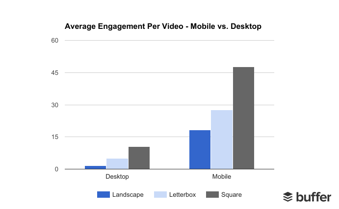
And along with that also make sure that the Video is optimized for Mobiles too as the above shared infographic also shows how many views are given using a mobile phone, otherwise it will leave a really bad impression on the visitor.
Where to Add Video on Your Business Website?
A video can be added to a lot of pages on your website, and there is no certain restriction in it. But adding it to some particular pages is seen to be more effective. So you can add the Video there;
Homepage:
You can use the Video communication to tell the visitor of your website what your business is all about and what services you provide. It can be a short clip giving an Intro to the user about you and your company.
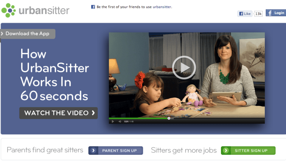
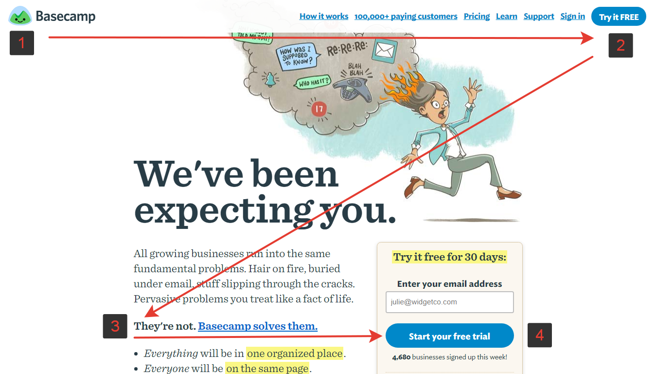
For example look at the website of UrbanSitter they have a Homepage Video and they have been doing great with it.
Particular Landing Page:
If your company has recently released a product and you want to market it on your business website, or you simply want your visitors to sign up for your service, use a Video on that landing page
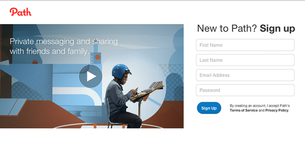 Just like the Path.com did this for their landing page and got great success you can do it too.
Page Background:
Another creative way of using the Video is putting it in the background of any page. This trend has been considered a very innovative thought and is believed to uplift the visitor’s engagement.
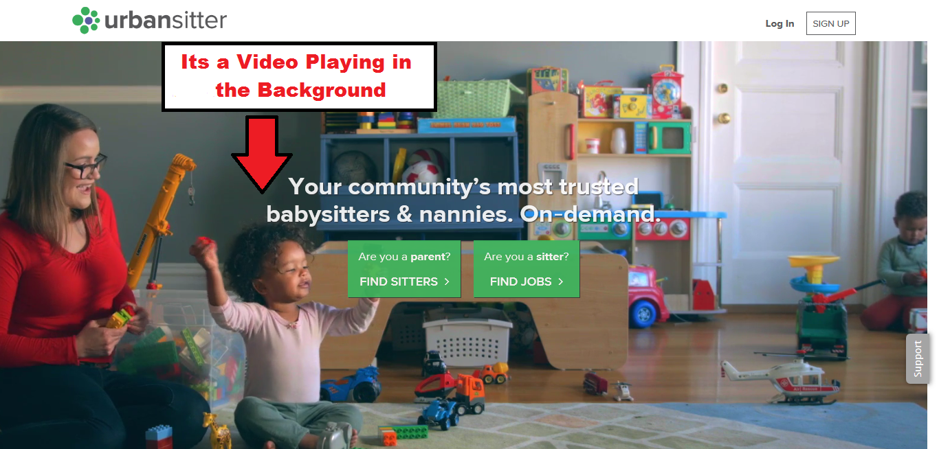
UrbandSitters is again a good example of a business website to mention here.
Do Your Business Website Navigation:
What is meant by it?
Navigation in the website design is just supposed to be some sort of guideline to the visitor. It’s the quality in the design which helps the visitor jumping from one page to another, easily. It basically means how the Website’s Menu and bar should be structured.
Let’s have a look at how Navigation is helpful and how should it be done.
How to get Website Navigation for Your Business Website:
Navigational Format:
Website Navigation is not very complicated to understand. Just make sure you are designing the Menu correctly. The sections of your website should be structured carefully.
Try to make the Website simple and well organized at the same time. A simple design for it can be this
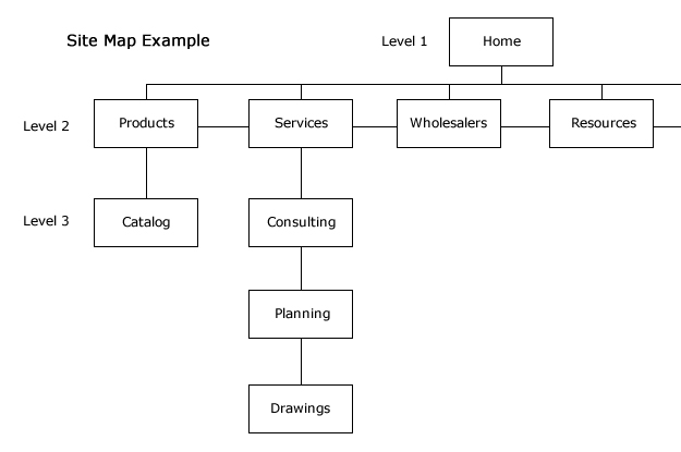
Most of the time this format is being followed and following this format won’t be a bad Idea.
Follow the Conventional Navigation style:
For your business website, don’t try to re-invent the Navigation style. When the whole market is following one path your user won’t like some level of differentiation in the design. So what’s the example of a good navigation style? Jcrew.com is really good from a Navigational standpoint today.
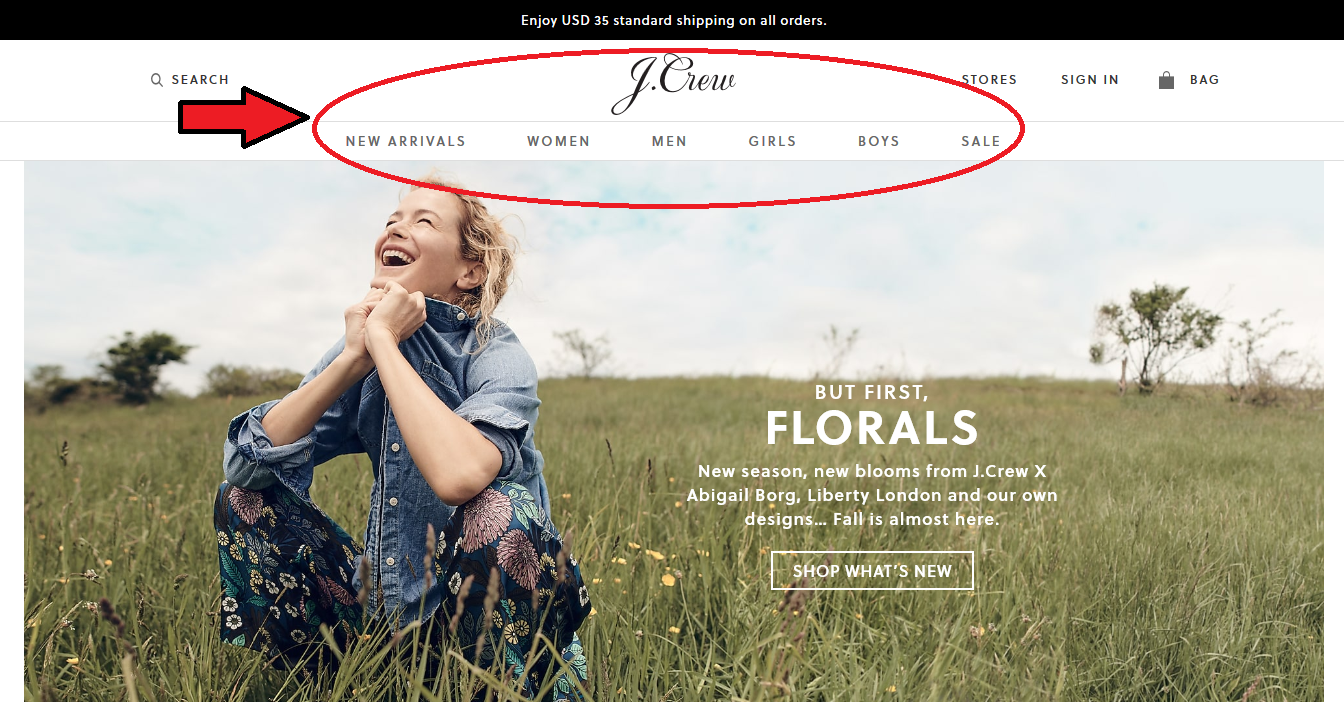
It’s because they are following the conventional style of the Big Categorizing Drop down menu that is being used by most of the big brands in their business website like Nike.com too.
Don’t Go out of the Line;
Just like said before don’t try to put a new and really different format of Navigation in front of the user. In the Previous heading I shared the current Navigational style of J.crew but here is what Jcrew.com used to look like before;
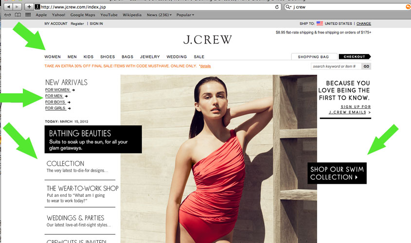
This Design was really confusing for the visitor. Because there’s too much text here and there on the web page its confusing for the Visitor.
However if you have a different type of Website and offers something unique you may want to change the course a little bit. But it needs to be creative in a way and shouldn’t let the visitor lose his way.
Link Logo to Homepage on your Business Website:
Although this practice is not applied that much but it do matter. Most of the visitor feels comfortable clicking the Logo of your business website to reach homepage.
And if the Logo is not linked to the Homepage it will create some disappointment for the user.
Show the Visitor his Presence on Website:
Get the Highlighted menu treatment on your website. Make sure on the Menu your visitor gets to know easily which page he is on at the moment. You can highlight that particular page by any method. Have a look at the following example
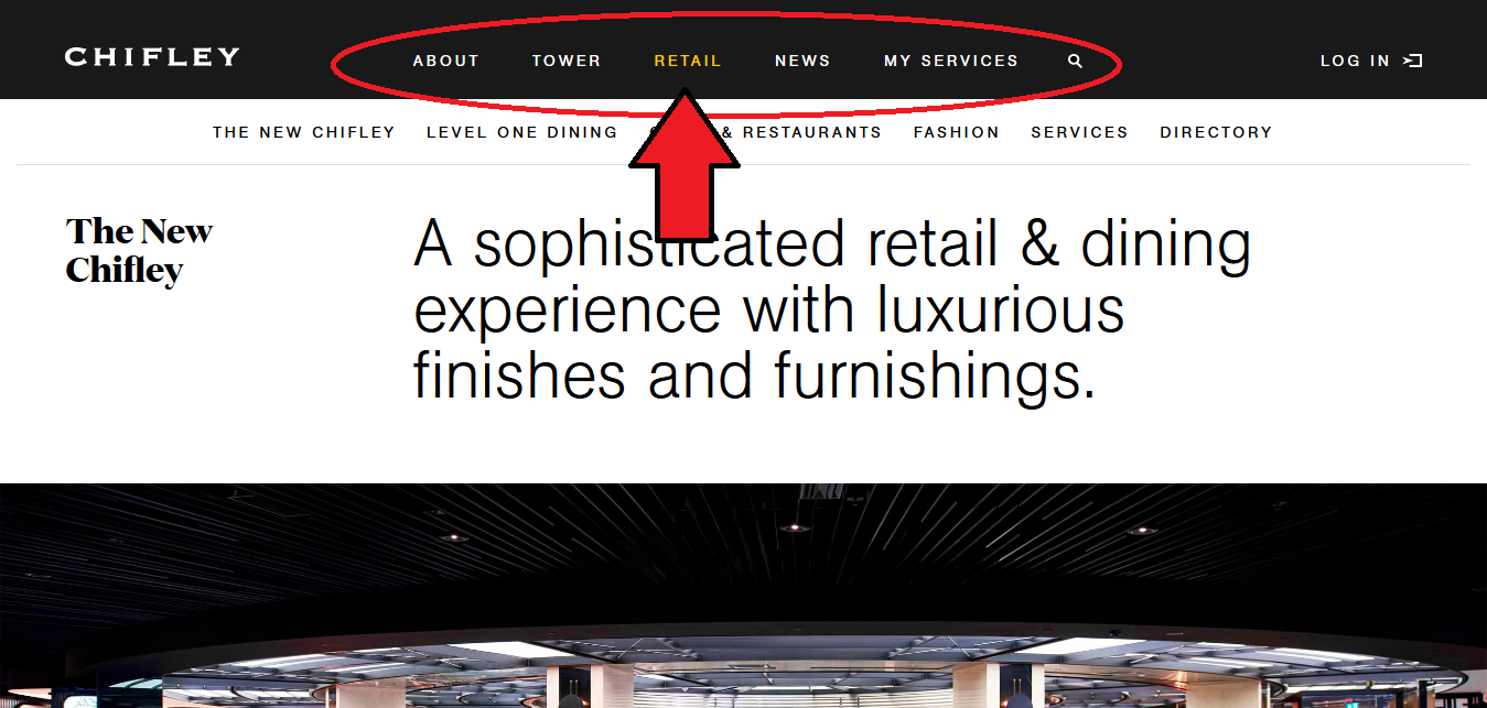
This feature makes the user feel that your website design is giving him directions to explore.
How is it Helpful for Your Business Website?
It helps him getting the visitor to view more than just one particular page. Your business website will definitely be in loss if it’s lacking Navigation, as it will make your visitor feel lost. What exactly it helps in are a few things;
Increase Visiting Duration on the Website:
When any consumer visits your business website, only a navigable layout can keep him engaged. Due to this continuous stream of Information we are getting through the Internet, the attention span of human beings is shortening really quickly;
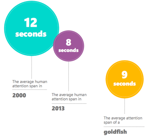
These Statistics shared by Venturebeat.com are really astonishing to give a point.
Think by yourself, when we humans have an attention span less than a Gold fish, would we like an unstructured layout of any website and stay there to search what we were looking for? Of course not.
So keep your website navigation on point to keep the user engaged.
Highers Conversion Rate on Website:
A business website with Navigation always gives a good Conversion rate in return. Navigation system allows the visitor to approach what he’s searching for easily. And when the user is provided an easy path to his destination his chances of buying the product goes higher.
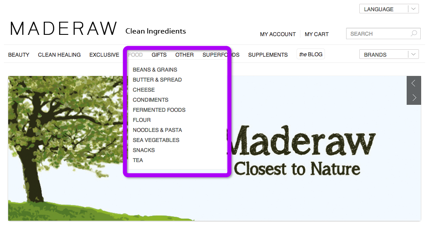
Just like Readyartwork.com shared the way to a Purchase can be made as simple as Maderaw;
First he would search for Food
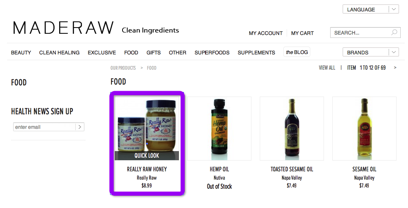
Afterwards his particular choice, “Raw Honey” here
And here is where he ads it to the Cart. 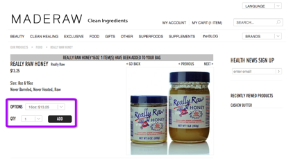
It is reported that around 50% of online sales are lost just because of poor Navigation in the business websites.
A Navigable road to a product or a page will automatically raise the sales and conversions on your website.
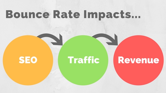
Lowers Bounce Rate on your Website:
This point is somehow the same as the first. Good Navigation in your business website will help decreasing the Bounce rates. And the reason behind it is simple;
An easy road path to the right information will make the visitor engaged and will thus decrease the bounce rate.
And on the other hand if the website is poor at Navigation the Bounce rate will increase drastically. And let me remind you that an increase in your website’s bounce rate will affect SEO and Traffic badly.
ALSO READ: 7 Reasons Why Your Business Needs a Website Badly
Use Human Face Images on Your Business Website:
Facial Images are always a great way of creating the user engagement. Human beings connect to each other and the content that has some humanly effect in it would do too. And it’s a Proven fact now that Images with human faces on websites do work better. Look at this heat test below; 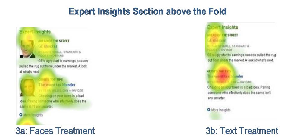
You can clearly see that the part with human faces got the user to Read more thoroughly. While on the textual side, the user didn’t even move out of the headings
Images are for sure the best way to consume Information but when you have Human beings portraying that information it’s fabulous.
How Human Face Images Help Your Business Website?
Using the Facial Images of People can help your business website in the following ways;
Grabs Visitor’s Attention Instantly:
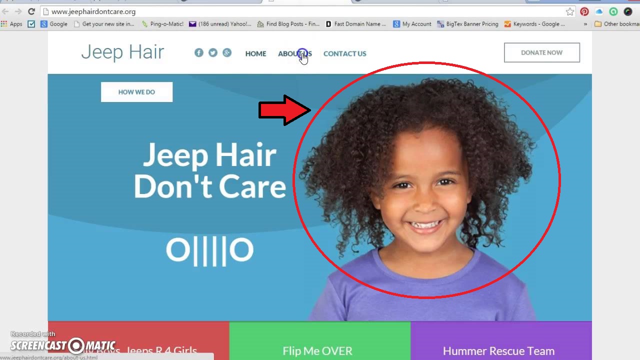
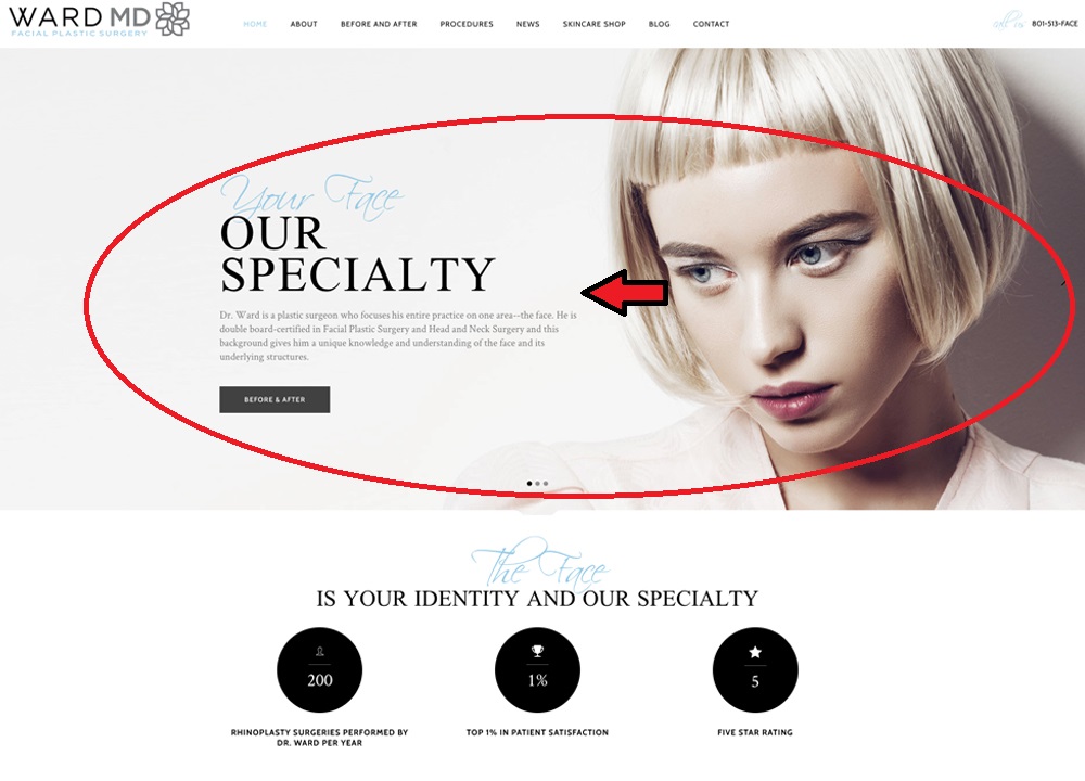
Facial images will grab the attention of the visitor as soon as he enters your business website. In fact a research has actually proved that this isn’t just a theory. Have a look at this picture below;
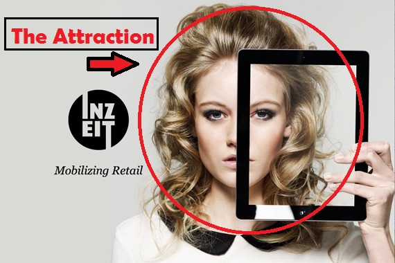
You can see that here the brand has used such an amazing picture on the page. Pictures like this have a great percentage of catching the visitor’s attention in the first sight. You can use this trick to convey a powerful message to the visitor as soon as he visits your business website.
Your user will be much more engaged seeing that facial image than he would do seeing text.
Expressions can Convey a Powerful message:
The key with using human being images are the Expressions. Human beings get attracted to other human beings emotionally. Many brands use this technique to contact and convey a message to the visitor when he sees the Picture. 
So George Clooney’s expression is urging you to have this cup of coffee. This is an example of how human faces can be persuasive.
So for your business website you can communicate with your visitor through the expressions on the model’s face in the image.
Builds trust in the Visitor’s mind:
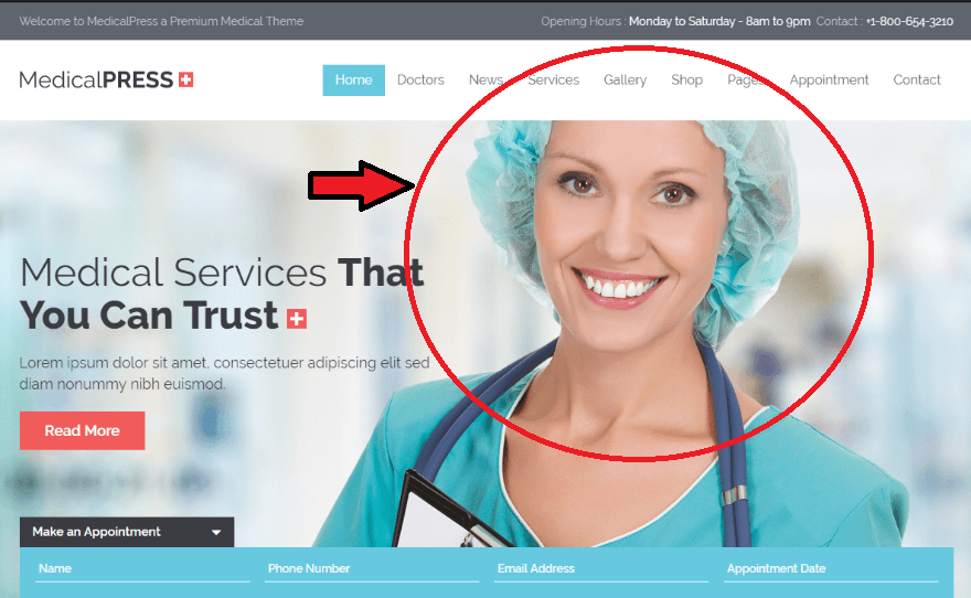
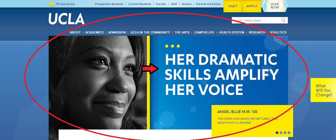
As said before, People don’t connect with businesses or websites, they connect with other people. And this humanly connection between your visitor and the image on your Website Page will build trust in your visitor’s mind. For example just look at this Website Page below;
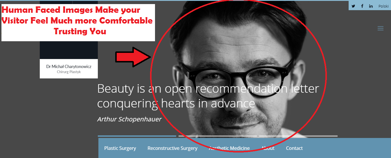
Many Researches and Studies have shown that using these kinds of Images on your Business Website will help the Visitor in trusting your website more. Some more examples of this are;
How to Use Human Face Images Effectively on Your Business Website?
Focus on Eyes:
Eyes are the most attractive body part in humans. From a Physiological aspect Eyes are really valuable when it comes to making the Image effective. Eyes work like a Machine and gain your attention with the first sight.
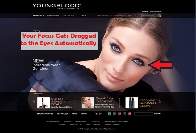
Even when you visit a website by yourself and see a face on the webpage, you attention is dragged to his/her Eyes automatically.
Use this trick to make a Strong influence on the visitor’s mind.
Use More Realistic Images on your Website:
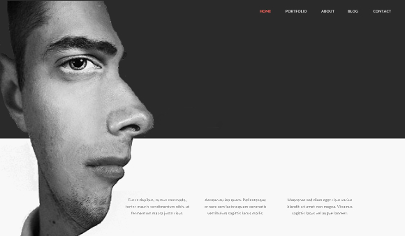
Always try to use the Images which are genuine. Don’t ever try to put some Stock Photos because your visitor will easily detect them. People make this mistake a lot. For example they would use these kind of Images; 
While they should’ve used these kind of Images Instead;
Those Stock Photos may seem more Professional but they seem unrealistic too. And those odd kind of photos make your visitor to lose trust on you. When you start showing your company’s true culture to your user, you start seeing them engaged.
Give Directions through Images:
Make sure your Images are used in a way that they direct the user to some useful information. For example look at some of the Webpages below;
These Webpages are using these Images to direct you somewhere. In Steve Krug’s book “Don’t Make Me Think” he states that “we don’t read pages. We scan them” while elaborating more on this he said that we humans have learnt that we don’t need to read everything.
So what you need to do is to give your user a direction to follow for more information and that’s it.
Don’t Make Images Complicated;
It doesn’t matter which page are you putting an Image on don’t ever try to use some kind of illusion creating photos. While most of the designers would think it would be creative, I’ll say it will be an extremely bad Idea.
For example have a look at this Page;
Yes, it was an Illusional Image. Now think again what happened there. You were so caught up with the Image that you didn’t notice anything further. This happens because designers are valuing the creativity of that Image too much and that’s killing the Value of your Website.
So try to add simple yet engaging Images on the Page instead.
Get Better Branding on Your Business Website.
I am sure I don’t need to tell you why branding is important for any business. We all can agree that a Business without Branding and Marketing wouldn’t survive.
Branding is always believed to be the biggest aspect for any business. For example do anyone of us would buy “Nike” Sneakers just because we were targeted on some Ads Campaign? No, we buy them because “Nike” has built their brand’s worth in the consumer’s eye.
So if you can showcase your brand’s true Identity to the user, you can easily make them connected with you. But when it comes to Website Design, Branding can get very complicated, because of the continuously changing trends.
So here are my Top 5 Tips for better branding of your business website;
Build a Brand Supporting Website Design:
The design of your business website presents your business to the consumer. So the overall design is the most important for branding. Thus to read ahead you must read 7 Untold Secrets of Better Branding through Web design.
Distribute Information over Webpages Specifically:
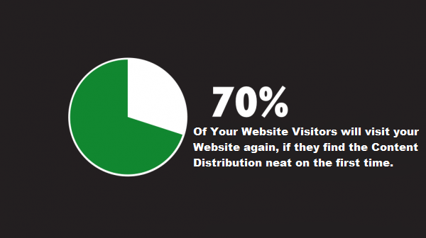
Be specific when it comes to content. Try to make different sections in your design and allow the user to enter in the right section depending on what information is he looking for. A research has shown that a Visitor is much more likely to visit again if he found your content distribution neat and clean on your business website.
Thus what you need to do is to make different sections/Pages for each type of content so that the user could easily get access to what he is finding.
Make Contact Information Easily Accessible:
According to many researches it has been proved that around 63% People will trust a Business more, if their Contact Information is properly mentioned. So make sure that your website is doing all what it takes to make the Contact Information easy to access. And it means more than Just a “Contact Us” Page. For example look at our website; 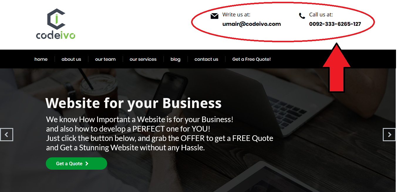
As you can see we have mentioned the Contact information on the even on the Home Page of the website. And moreover we mentioned our contact information too which isn’t a common practice by most of the businesses. This act of us put us close to the consumer and that’s what we all need.
Give a Specific and Strong Call to Action:
Every business has some intention with their website. Some kind of goal they want to achieve. Some want their visitor to sign up, some want them to buy their product, some want them to read, and some want them to hire them. So make it clear to your user what do you expect them to do.
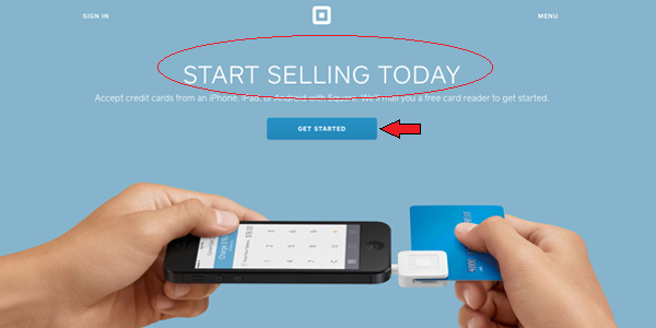
Telling your visitor to do something specific is not going to hurt anything on your website. Just to be more specific and direct when it comes to giving them the Call to Act.
ALSO READ: 7 Stunning Qualities That Make an Expert Web Developer
Follow The KISS Rule on Your Business Website:
“KISS” is an acronym that stands for “Keep it simple, stupid”. This rule was developed in 1960 by U.S Navy. What KISS Rule states is that “every system works best when it’s kept simple rather than made complicated”. And that’s the rule you need to follow in the design of your Business Website too.
Just make it simple, don’t complicate things. A lot of Web developers make complex designs which perform badly.
How would a Simple Design help for Your Business Website?
A simple design for your business website can be really beneficial. Here’s how;
Easy to Scan:
Just as said before, we humans don’t read pages, we scan them. So keeping your website simple in design will help the user getting each aspect understood easily. A lot of business webpages make the mistake of putting a lot of information on a single page which in return confuses the visitor. For example your website should be more like this;
And shouldn’t be like this;
Because such a page create problems for the user to focus on one thing at a time and it affects usability.
Less Time to Load:
Simple website pages load a lot faster than complex ones. And let me remind you that your visitor don’t have time to wait for your slow loading website. You will be stunned to know how fast your website loading should be, because otherwise the visitor will simply just bounce back.
 So try to keep you’re the Webpage of your Business website as simple as you can, because the higher the bounce rate would be, the badly it would affect your Search engine rankings.
More Conversions:
Its not something a lot of developers know about. A simple and clean website design will have much higher conversion rates than a complicated one. Sometimes being complicated means the design is simply out of date. For example look at Skinnyties.com they increased their conversions when they redesigned their website. 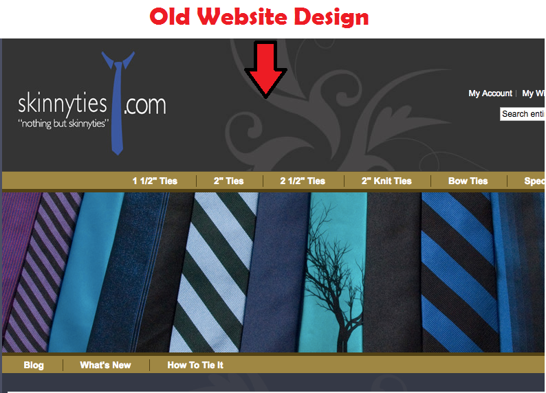
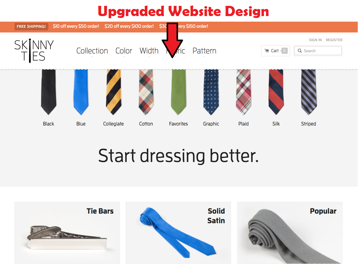
To be precise Skinnyties.com reportedly got an increase of 13% when they had this development to their website design.
What Makes a Simple Business Website Design?
We looked at its benefits now let’s have a look at how can you get a simple design for your business website;
Use White Spaces in the Design:
Using white spaces in your website design can be really helpful when it comes to creating a simple design. White spaces are great for making the user focus on something particularly. This trick makes the user feel comfortable while consuming information on the page
Moreover having white spaces arranged wisely also help you to highlight the area you want to highlight.
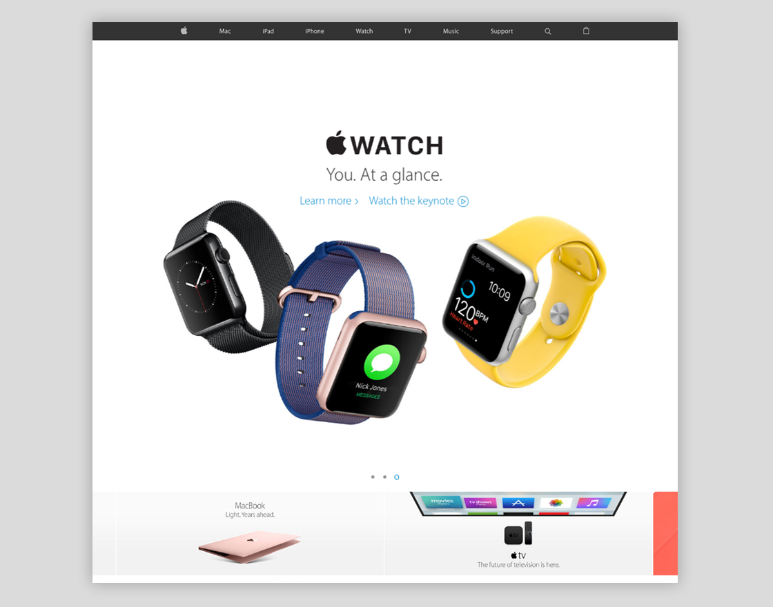
This is the place where Apple always wins. Apple.com always has used white spaces to promote some of their particular product more in the user’s eye. Just the way they did it for Apples watches.
And they also used this tactic for IPhone X, with this web design;
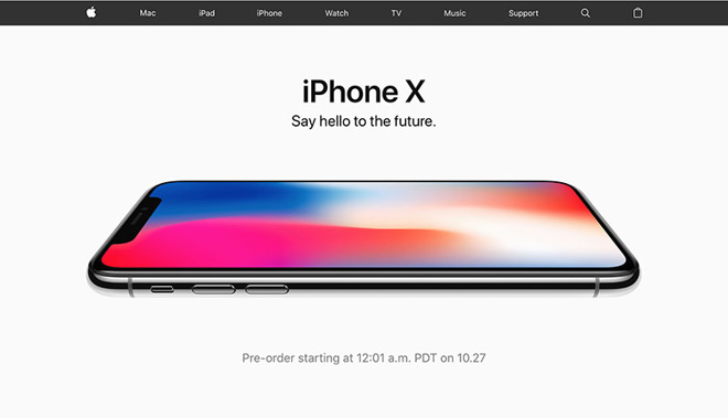
Using white space helped them making the user focus more on that particular Item which they were trying to promote.
Follow the Z-Pattern:
In researches it has been seen that most of Users follow the Z-Pattern when it comes to scanning or consuming content on the web page. The Z-Pattern is actually the direction user moves on your website with his eyes.
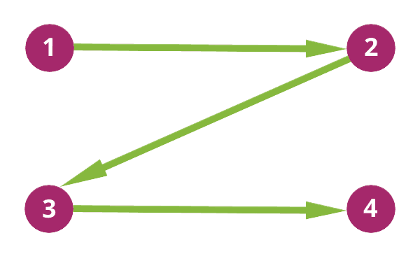
And your website design should be something that could correspond to that Z-Pattern. So your website design would look somewhat like this;
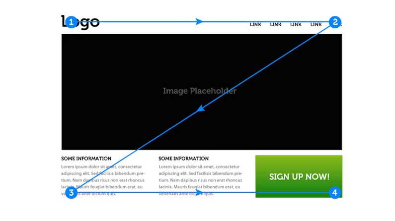 All you need to do is to make sure that your web design is have content on it arranged in a way that it leads your visitor to follow up in a Z shape pattern.
This pattern has been believed to be the most engagement creating pattern. A lot marketers and web developers always design their website according to it.
An Example of a Business Website following this Pattern is;
Stick to some Particular Type Faces:
Choose particular typefaces for your business website and stick to it. Being specific with typefaces is really helpful in getting your user involved with your content. The reason is that the particular typeface will soon become a part of your brand and the user will start correlating your brand with that typeface. For example have a look at the Neilpatel.com
Neil’s website is a great example of how wisely someone can use Typefaces in branding.
Continuously showing your user the particular type faces in your content will make the web design more credible and professional looking.
Choose some theme Colors:
Colors on your website can set a standard for your brand. Just stick to a particular set of colors and use it as a theme. What a lot of People do wrong is that they try to use many colors on the design which ultimately leads to making the design Flop. 
Just as the above design have many colors but it’s nothing to be proud of. You don’t need to create a Rainbow on your business website.
Checkout how Brian Dean’s Backlinko.com has set a tone of color;
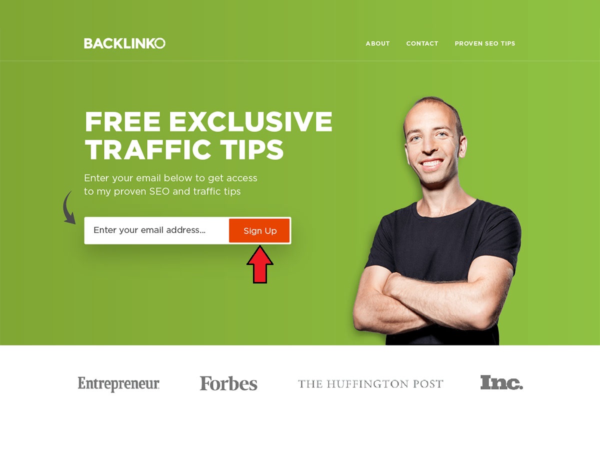 Just as he has a Greenish Main theme for the Website design, he also has a particular Reddish Color for the Buttons on the Website. If you check out Backlinko.com you would see he didn’t used any other color to highlight any button more.
This tactic is great because in this way the user will keep those colors in mind as your brand’s authority. This is the same thing you see on Codeivo.com too.
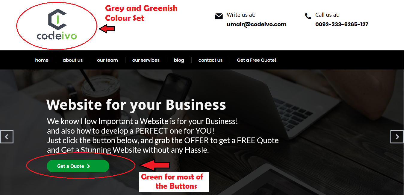
Our website has Dark Grayish and Green colors in its design.
Conclusion:
One important thing to mention here is that don’t think all what I shared here are some temporary hacks. All these tactics and strategies ensure long term positive effect on your business website.
None of these features will lose their worth in the next 7-8 years. But will continue to matter even more and more.
Personal Advice:
Being a part of a Web development company and a digital marketer too I can say that although all these things are the ultimate hacks you need for your business website to grow it, but still none of them would be useful until you execute on them.
It’s Your Turn Now!
I have tried covering each topic going as deep as I could. This list obviously isn’t all you need to focus on to get your Business Website impactful, but it has covered the most important factors.
Now it’s your turn to respond to it. How do you feel about this post? What feature did you found the most interesting? Which feature will you add up first?
Will you focus on adding Videos to your website design, or you’ll be more concerned about getting more engagement by using Human Faced Images?
Either way, do leave a comment down below. I will respond to each single one of them.
Leave a Reply