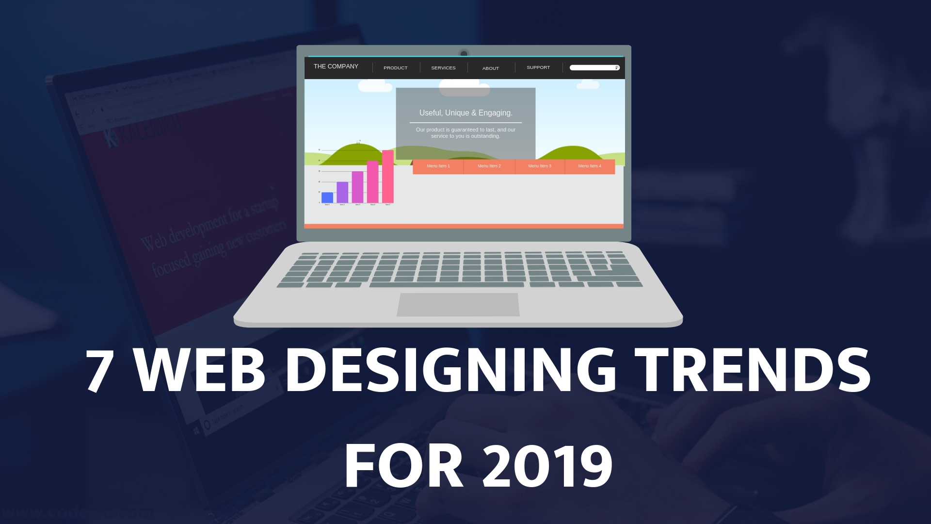
Why web designing is so complicated? Because when it comes to web designing, it’s trends changes every day and you have to keep up with them.
It’s 2019 now and the Internet world keeps moving forward as time passes.
Thus if you want to stay strong within your industry you got to learn more about the new trends this new year has brought to us. These tips are especially important for business websites because Websites reflects your branding.
So without delaying it further, let’s jump into the new tactics that you need to apply on your website in 2019.
Animations triggered by Scrolling.
Animations are one of the best ways to get the user to engage into the website’s content. Many reports and studies have proved that Animations in the website design help a lot in getting better results.
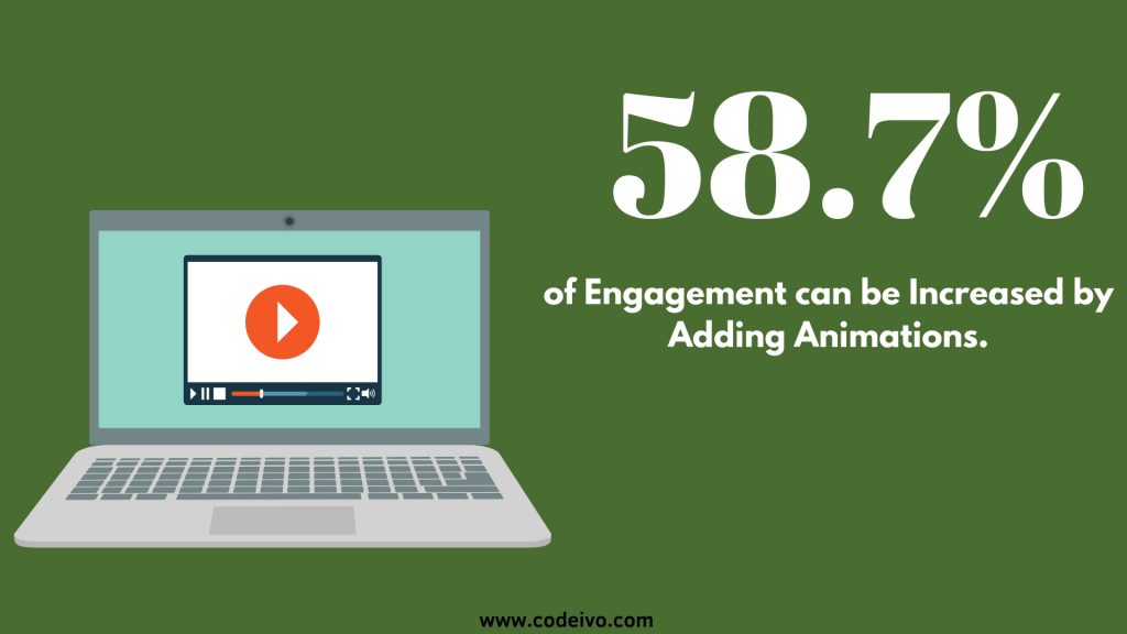
This is one of the best tricks to get the visitor to engage into the web design more. While this web designing trend was seen to be emerging a little in 2018 it would be a really good thing to use in 2019 for your website.
What is meant by Scroll triggered?
Scroll triggered animations simply mean that animations move while being controlled by the user as he scrolls up and down. You can synchronize the animations with the scrollbar and can choose some elements to move with respect to the scrolling. A good example of it can be seen below. 
How does these Animations effect?
Some of the benefits of making use of these animations in web designing are;
- Good User Experience
Animations gives the user a sense of comfort ability and it does makes exploring the website more arousing for him. And it has reportedly seen that the more good quality animations are there on the website, the more the time that user spends on it. - Customize Your Content
So animations within the design can easily customize your website for any particular niche or category. And you can play with the details a little bit, to shape the design according to the image your brand has. This way you would be free of a lot of restrictions that come within the design. - Better Story telling
Story telling is the end goal for any brand and by adding some animations within the design of your business website you can aesthetically tell the story of your brand. - Draws Attention
Animations in web designing is a really good Idea to draw the attention of the person to any specific area. This really helps engaging the consumer into the content. So in other words the animated stuff on your website can help your user to take interest in your website.
How to use Animations within the Web design effectively?
When it comes to Web designing and Animations you need to take special care of things. Here are some basic tips on how can you use these Animations Effectively;
- Make it Smooth
While you are adding some animations which particularly are triggered with scrolling over screen then make sure the movements are smooth. You don’t want to add some irritating and fast moving animations to the screen which frustrates the user. - Base the Movements on User Expectations
Make sure you add the animations and make them move on the screen just as the user expects them to be. For example have a look at Ariel Bianca’s Website and see how they have organized the movements so good. The animations are not something that that would be surprising for the consumer.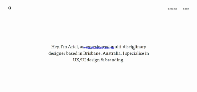
- Add Progression Animations
Progression animation is the animation on your website that the consumer sees while the site is loading. This animation is one of the biggest weapons for your website to keep the user engaged and not let him bounce back if the loading time takes a little longer. Multiple Examples of Progression Animations can be found on the Internet.
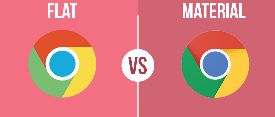
2) Material Design over Flat Design 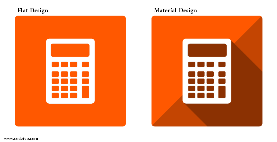
This difference has been there in the web development industry for quite a long time now. For many years Flat design was being used all over the Internet but then Material design entered and soon they both were being used by web designers.
Although flat design has been there for a long time and even till this day in 2019 it hasn’t been wiped out from websites and even make a huge chunk of website’s design.
Why Material Design is better?
When we know that the whole of the internet is mainly based on these two type of Designs, then how do we judge which of the following is better?
Here are some of the things that make the Material design better than Flat design;
- More Dimensional Look
The reason Material design is now believed to be better than Flat design is simply that Material design does give a more widely dimensional view. And all the people related to graphic designing know that a 3D image would work better for the visitor than 2D.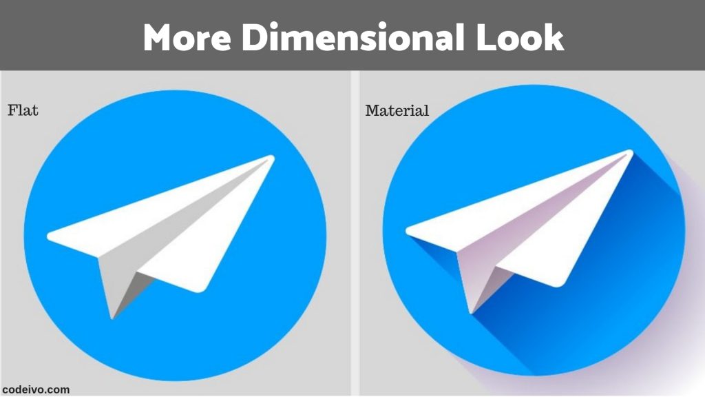
- More Clarity
Material design is simply clearer than the Flat design in a sense that Flat design possess gradients and blurred designs while the Materialistic designs are more about drop shadows. The same is the reason why Android’s user generally doesn’t recognize iOS icons instantly. - More Details within the Design
It is considered that the Material design evolved out of the flat design itself. But what’s better in this type of design is that it has more detailed work in it. Material design is believed to contain more interactive design, a better color system, better layout and functionality which empower the design for better User experience.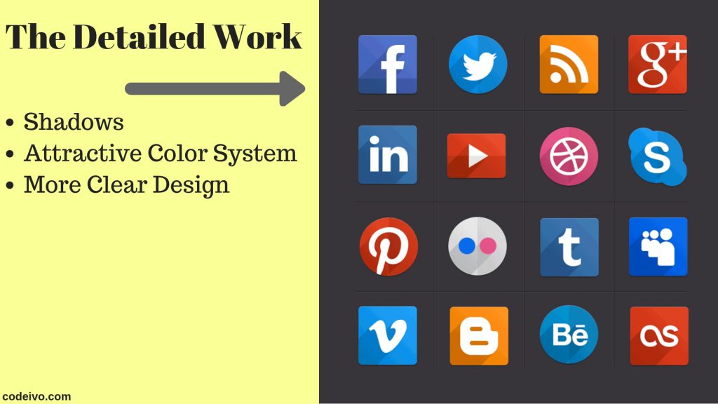
Things to Keep in Mind When Using Material Design.
While using the Material design in your website here are some of the things that you should keep in mind that will help you avoiding mistakes and maximizing the output o this feature.
- Avoid excessive shadow effects
Shadow effects are the first thing that most of the designers start with as it’s one of the feature that makes the 3D look. But most of the amateurs use this effect a lot more than what should’ve been used.
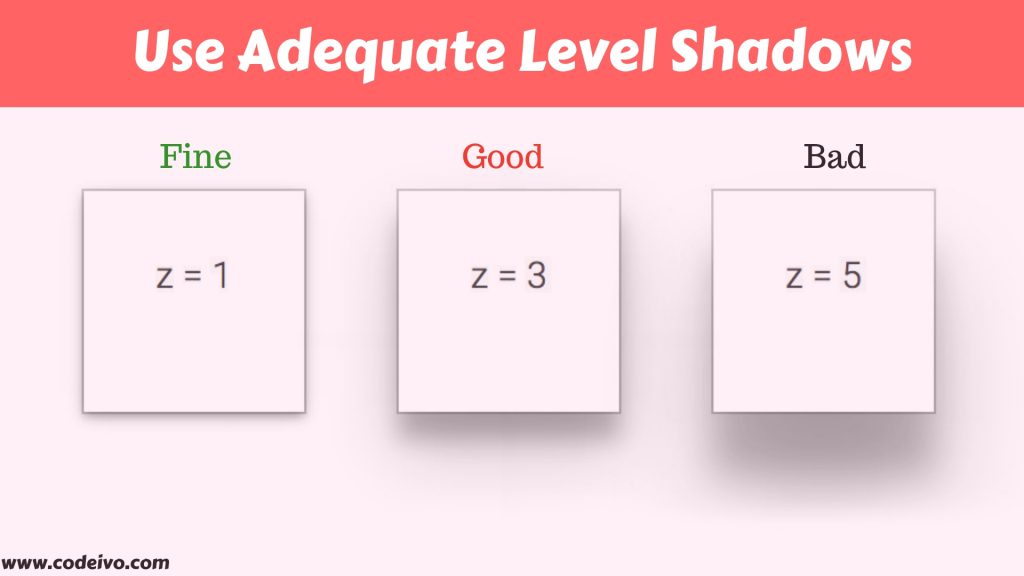 Excessive and unnecessary shadow effects put a really bad impression on the consumer and can make a mess of the design over all.
 - Prefer Dull and Smooth Color scheme.
Although this depends on what type of brand you have but for a general rule we can say that in Material design, smooth and little dull colors perform well. The reason for this is its multi-dimensional look having more effects in it. Thus the use of bright color scheme can make the design look weird and irritating. For example if you had chosen “Crimson” as the color than in Material design “Ruby” or “Rose” would be a better choice. - Don’t Ignore Material Design Grids.
One key thing that can make the Material Design on your website more aesthetic and attractive is the use of the Grid and the Keyline’s within the Material design. There are some margins left out horizontally and vertically which you should design according to. This concept is used in many app builder software’s and professional app developers.
Why use Material Design in 2019?
The question now is why is this the right time for you when material design has been there for long period of time? The answer is simple, today Web designing has reached a potential which it didn’t had some years ago. And Material design is one of the most rapidly emerging web designing trends to make your design prominent.
And if you use it creatively you can add things on your website which can drive incredible response. For example you can add Incorporating Motion to make the actions done by the user more visible and clear for him.
3) Use of Creative Typography in Website Design
Web designing is majorly about the visuals now. And Typography plays an important role for that.
Typography is a kind of art mostly attached with graphic design. It’s basically described as a process of making the textual data appealing and legible.
Mostly this aspect gets ignored by designers because they usually hear that Visuals are the most important in the design of any web page. But the thing is Typography can also be used to make the design visually more attractive.
The Analogy of using Typography in Web designing
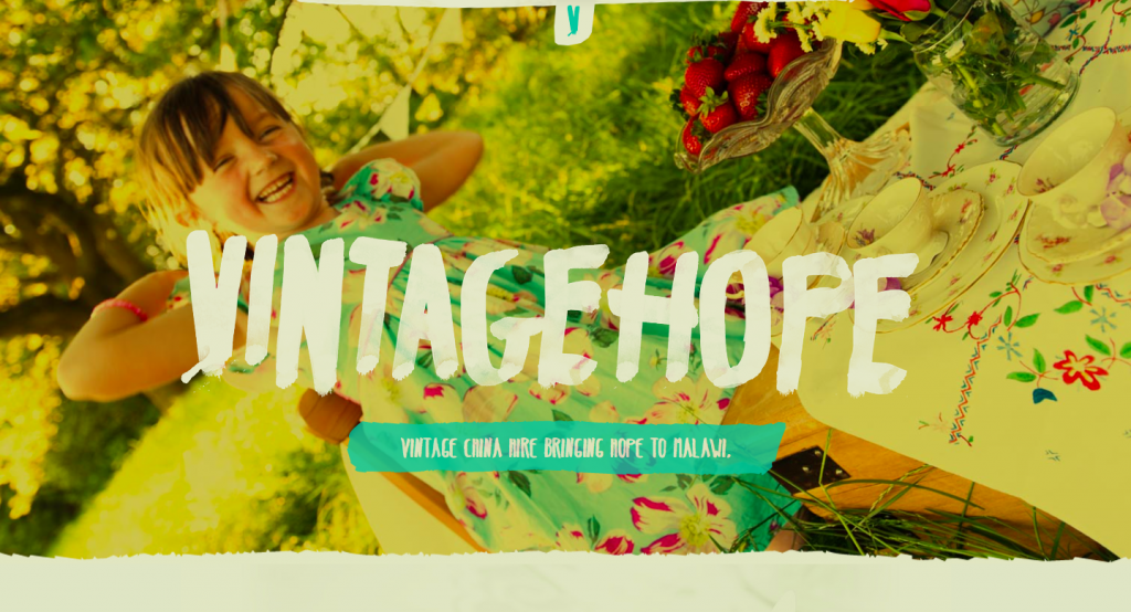
In 2019 you would need to do something better than before. Look at the example of a webpage shared below. That’s how they are conveying a message with using some words arranged in a certain way.
Typography can’t be something that could be taught directly. The only easy way to understand it is to think of how can you innovate and re-new the identity of your brand/product/service using typed words.
Keep one thing in mind, Typography is something customized and can’t be done the same for every web design. It depends on what type of brand it is, what the website’s audience is etc.
Here are some other examples to understand this concept;
Another one we got here as an example;
You missed something! The website’s pages shared above are the website’s for children and if you look at the typed letters you would notice that their font correlate with hand painting. In simple words the web designing here is intentionally kept much more funky here.
Now have a look at the web page below;
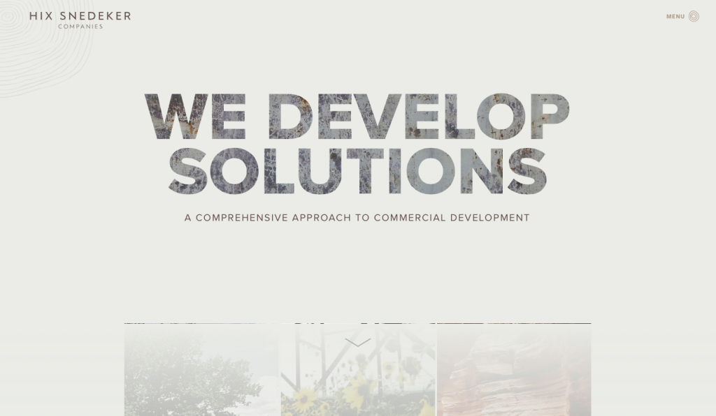
This website was targeting the clients for commercial development and that’s why their design was pretty simple with a more formal font type. Even in this design the words do have some level of texture within them and this contributes to making the design stunning.
Things to focus on for a Typographical Design.
Web designing could be enhanced using adequate Typography. And Typography is not a rocket science. All you got to do is to focus on some of the terms and rules and make a good use of them;
- Size:
Keep in mind that not all typefaces are equal. What does this mean is that if some words are typed in different typefaces they’ll appear of different size on the web page. So you would need to manage the size of the text accordingly. Use the size - Leading:
Basically what ‘Leading’ means here is the vertical space between the two textual lines. Generally this space should be large enough for the reader to clearly read and see the difference between the two lines. A rule for this is to make the gap a little more than the font size. - Kerning:
‘Kerning’ here means the space between different characters of the same word. This basically is done so that the letters don’t merge into each other. But with their gap being in your control you can do a lot.
How exactly does creative typography help?
As mentioned before, when used creatively Typography does create some sense of relevancy with the design.
And this relevancy works really great to trigger the customer and make the design attractive, because the right typography would align the page along with the words just as it should be.
And then according to some case studies the beautifully typed data on the webpage of your website can make the visitor engage more with the content and thus stay longer on the website.
4) Consider Icons Library mandatory
If you know the basics of the web design you know what an Icons Library looks like. But to make it more clear have a look at the screenshot below;
For any web designer the ultimate goal is to make the page easily scan able and Icons Library is one of the things that help the user in this regard.
This same concept is used by many software developers and app creators in their projects to make the visuals more engaging.
Why Icons Library is important for the Web design?
Icon Library is not too rare on the Internet. But why is it important? Here are some of the benefits and reasons why it it makes it’s place in Web designing;
- Makes the Page Easy to Scan:
One of the key things that Icons Library helps in is that it plays an important role in keeping the design simple and easy to scan for the visitor. And that’s what web designing all about. When a visitor visits your website he needs to know what product/service you have to offer or what are some of the basic features of your brand? And having an Icons library would allow explaining it to the user in a compact way. - It makes the content interesting:
The content on your website needs to be presented to the visitor. But if you show him that content in an odd and traditional way, the visitor will simply bounce back.Thus the icons library can help in making the content on the web page more interesting and engaging. The same rule brought 22% more clicks on the hamburger’s button when placed a border around it, a study by James Foster. - Can define the personality of your brand.
Every part of your website design contributes to the identity of your brand. And the nature of these Icons can define your brand very well. The colors you use and the type of Icons you use all can contribute to presenting a specific Image of your brand to the visitor.
How the Icons Library should be designed?
The Icons library does make a good impression on the visitor, but only when designed in the right way. And to do so there are some of the things you need to consider;
- Use Clear and Common Icons:
These Icons will make a visual impact on the visitor and the user would be directly attracted towards them so keep in mind that use the Icons that the user can recognize and be remind of.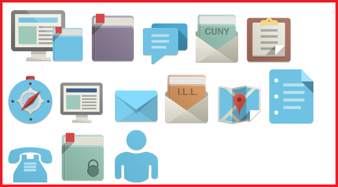
- Use Relevant icons with the headings:
Make sure that for each heading that you out you use an Icon that’s relevant to what is being discussed. This has a specific importance because Icons are meant to bring a visual representation of what you are telling the user. Web designing is all about relevancy. And if the Icon’s Image is not relevant to the heading it won’t impact the way it was supposed to. - Use Material Designed Icons:
Material design still wins here over flat design. The reason is simple, material design will give an extra expressive view to your Icons which can easily attract the visitor’s and catch their attention in the first look. For example the Icons designed with Material design can be given an extra dimensional edge like adding shadows etc.
- Don’t change Icons for Common tools:
These stylish Icons will definitely help your website design getting better and can give a new look to your brand. But avoid using them for some commonly used tools because the audience may not be able to recognize.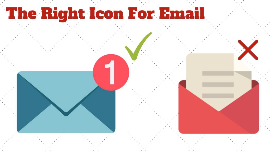 For example the traditional Icon for “Email” is a letter box, but if you change it with a new Icon, your visitor’s may have a hard time finding the Email option. Because in web designing it has been traditionally accepted like that.
5) Mobile Optimized > Desktop Optimized
Mobile optimization is not specifically a Web designing trends, but is something you need to focus on.
If you have ever hired someone before for web development service you would’ve noticed that one thing. Almost every website developer make sure, while auditing your website.,that it’s design is Responsive.
And when we say responsive it means it has a decent view for every device, including Laptops, Smartphones, and Tablets etc.
Now, If you paid attention from the past recent years what you heard was that;
Your website “must be” Desktop optimized and “should be” Mobile Optimized too.
But in 2019 saying the following would be better;
Your website “should be” Desktop optimized and “must be” Mobile Optimized too.
This simply means that 2019 is the time you should make the Mobile optimization a priority and shape your website template according to that.
Why Mobile Optimization is more important in 2019?
Back in time the only way 97% Internet users use to browse websites was through Desktop. And this number has been decreasing since then.
So what happened here? With the passage of time the usage of Mobile devices has increased like crazy. And today about 60% of searches that are done on Google are done through a Mobile device.
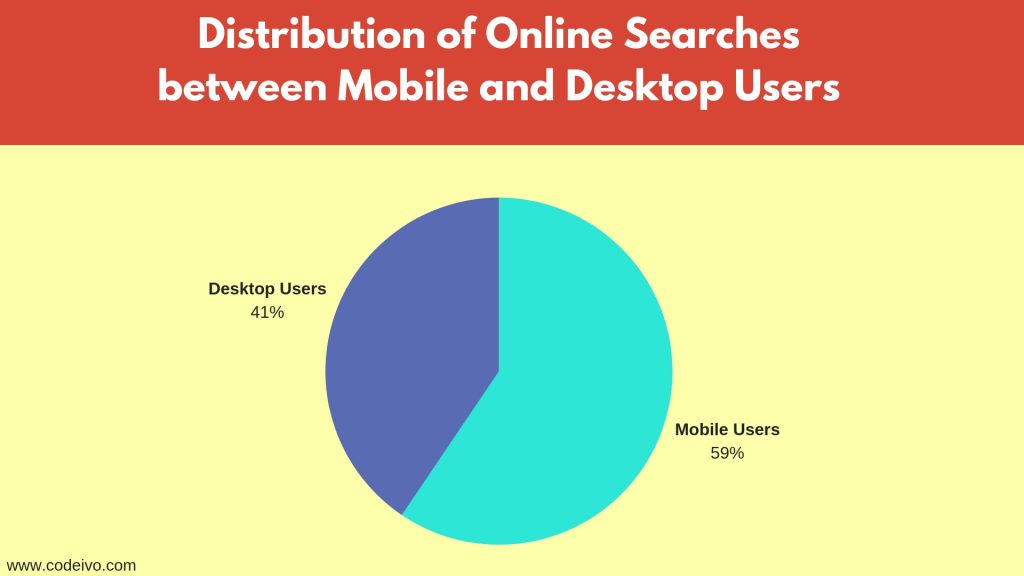
Smartphones have made a revolutionary contribution in Internet browsing. That means more than half of the visitors on your website are visiting it through a Smartphone.
So what does you need to do? Simple, Your web designing needs to adapt now.
You should pay really close attention to the Mobile optimization of your website and make sure it’s design gets the best visual experience to the user.
How exactly should you Optimize your Website for Mobile?
Now when we are aware of the importance of Mobile optimization in web designing.
Let’s have a look how exactly you can optimize it effectively; these are the things all web development courses talks about.
- Compression within the Design:
Compression is the widely used tactic in web designing. For getting the best performance of the website page on Mobile, compression of files is the best option. Files when compressed would cover less space. Some compression tools help really well in this. For example HTML Compressor when used can automatically remove all the pointless white space in the design and the codes that were unnecessary.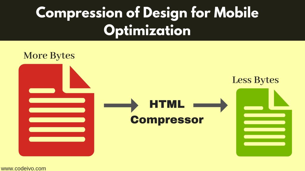
- Design the Website for Touch:
When you are optimizing for Mobile Devices, in 2019 almost all of them contain touch screen and a user on his smartphone should be easily navigated through your design. Keep in mind how he will touch the headings and the menu and design accordingly. When a user doesn’t find usability in the design he simply bounces back so try to make the design as smooth as you can. - Have a Fast Loading Design for the Website:
Although site load speed is something that is important no matter which device the user is on. But in the case of Mobiles for, effective web designing, the load speed is a much important component. The reason is that the load speed gets exponentially enlarged in mobile devices than on Desktop. For example if a site loads in a fraction of a second in desktop, it take multi seconds to load on a Mobile Device. - Minimize the Pop Ups appearances:
Let’s face it, Pop-ups are really annoying for the users, especially on mobile, but they are important in some cases. So what you should do is to make them appear smoothly in an attractive manner, load faster and the user should be given the option to close them easily. These are the things that only experienced web designers and developers understand.
6) Make good Use of Video Content
Videos can be made to play an important role in web designing. And is considered one of the most effective designing trends. We all can agree Videos let you convey your message powerfully to your consumer.
So, Why Video?
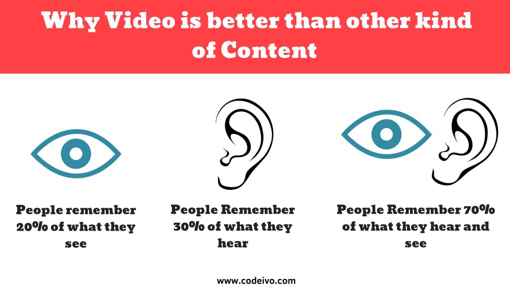
Video is considered the Future of the Content marketing world. The reason for this is that Videos are simply the best way of conveying your message.
On the ground level you only have 1 goal and that is to communicate with your user. Out of written content, audio and video, Video does the best work for you when it’s about engagement.
This trend started popping in the year of 2018 mainly and now there have been predictions about this trend being adopted by many websites in 2019.
That’s the same reason why a lot of web development companies and digital marketing agencies recommend adding Video on your website. So much so that it may soon become a threshold for the web designing to be effective.
Benefits of Adding a Video on your Website
Now let’s have a look at some of the benefits that come along with adding a Video on your website;
- Grabs Quick Attention:
Videos are the most fast attention grabbers and there is absolutely no replica for this. No written content can do this or the audio. Humans connect with other humans and if you can get a good interactive Video on your website, the visitor’s attention will be drawn quickly to it and chances are he would listen to what you say. - Tells the story more powerfully:
Now when we talk about web designing, your website’s design is to convey a message and it’s done through content. Every piece of content is supposed to tell a story. And a Video does this in a much powerful way, because it’s much more interactive for the user. - Helps in Conversions:
Videos are the best way to communicate to the user. Videos can convince the users more easily to buy something. Thus Videos on any product page can get you more conversions. That’s the reason many website designers recommend adding a Video on the landing page for any of their product.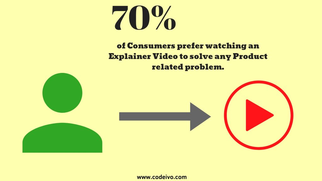
The Best Place to add Video on your Website?
Now when you know the importance, the question that rises is where the Video usually works the best? Normally there are many places you can add the video on your website.
For example you can add a Video on the Home Page that could be an introduction for your brand. You can also add a Video on a specific Landing Page that you want to drive traffic to. But out of all of them the best place to add a Video in the website design is the Background of the Website.
It’s true that Videos on different places are for different goals. But background video can be regarded as a good practice for web designing in general. There are two reasons for this;
- You can Stand out of the Competition
Although using Videos as the background of the home page was being started in 2018. But till 2019 it hasn’t become a common practice and most of the websites aren’t using it. Even only a fraction of big brands have used it yet. Thus you can stand out of the competition by doing it, because chances are most of your competitors won’t be practicing it.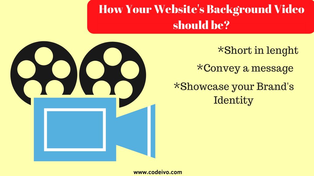
- It Conveys an Indirect Message
The video that you use in the background is really different from other type of videos that you sue on the website. The reason for this is that mostly it has no audio. And all this video is subjected to do is to convey an indirect message to your consumers. You can make a Video that showcases your brand’s identity.
Things to Keep in Mind when Adding a Background Video:
When you intend to involve video in your web designing layout, keep the following things in mind;
- Make sure that the length of the Video is not too much. This video should be long enough for the consumer to understand what product/service you offer while making sure it don’t gets boring for the consumers. 15-35 seconds can be a good length for it.
- Make sure Video isn’t something just a typical one. The type of introductory Videos in which a guy stands up and talks looking at the camera won’t help. It should be some sort of a short story or creative clip that could help the user understand what your website is all about.
- Make sure the video is mute. There isn’t any other certain reason for this but because it doesn’t make sense at all. No one would like to listen to a video they are merely watching because of the icons and other buttons on the web page. Remember a Video is one of the Features that makes a Business Website impactful. Thus use it effectively.
ALSO READ: 5 Features that make any Business Website Impactful (Tactics Explained)
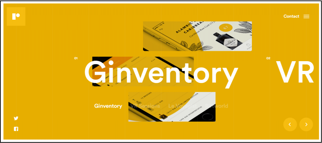
7) Broken Grid Layout
If you are a little familiar with the web designing a little bit in the past than you already know what a Grid is. So basically Grid on a website is the Layout of a website.
How different elements are arranged within the design of a specific web page and what’s their alignment. These are some imaginative lines on the basis of which web designers usually design websites. The following image by CSS Grid gives a good example in this regard. 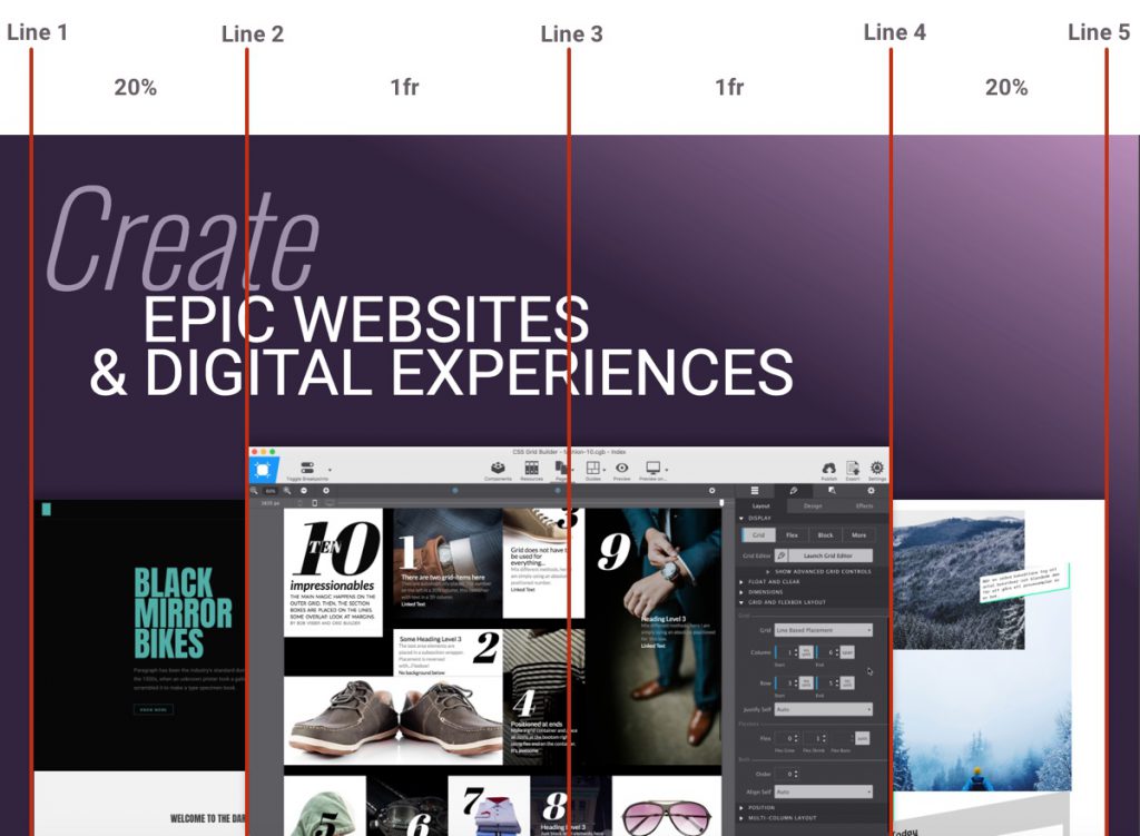
But what do we mean by Broken Grid Layout?
Broken gird means an asymmetrical web designing. We can say it’s some sort of an unusual use of the Grid. In this case the design is disrupted in a way that it makes the design more attractive and better in some sense.
Why Broken Grid Layout?
The following points explains the significance of this feature;
- The reason you should go towards Broken Grid Layout is because the whole industry is looking towards symmetrical designs. While by breaking the Grid you would be able to give the website an innovative touch. This can give you a competitive advantage over your competitors. This feature will let your website stand out and makes web designing effective overall.
- Another good reason to break the grid is that this way you get good customization for your website. And in turn this can represent your brand in a good way. For example if you are an artist you can get a broken grid design and that can do a good representation of your brand.The same goes for the design of Upperquad
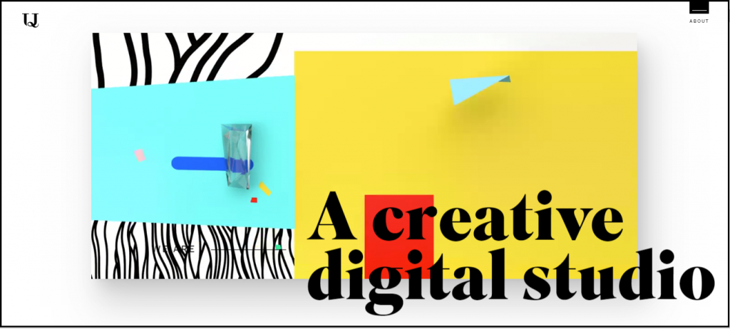 I am sure looking at their home page you got the Idea that these business are somehow related to Graphic designing. Websites like these represent what the website is all about, very well.
What’s the right way of Building Broken Grid Design?
But the questions that rises now is that how can you build a broken grid design that do look good and do the job properly? What are the web designing tools or languages used for it?
What most of the designers do wrong in it is that they make a mess while trying to break the grid. And to make sure you do it the right way, here are some of the guidelines to follow;
- Add Appropriate White Spaces:
White spaces can help a lot when it comes to arranging and aligning the design. And especially if you are breaking the grid then the right use of white spaces can help making the design decent.One another benefit of this is that you can lead the visitor to any specific area you want him to look at.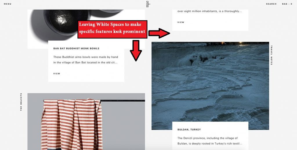
- Create Layers of Elements
Make a good use of layers on the web page. What we mean by this is to play with the design a little bit. Put some layers of text over an Image.Or you can layer text with text or merge 2 images and then layer some elements on it. As long as the layout doesn’t get messy overall, you can change things up. But one thing you need to make sure while doing it is that the Navigation doesn’t get affected by it. Keep it simple and make clear layers that don’t confuse the user. For example have a look at the home page of Reed.
- Disrupt the Positions
Make the usual design a little unusual. Bring some art into it. Let’s look into an example for this one.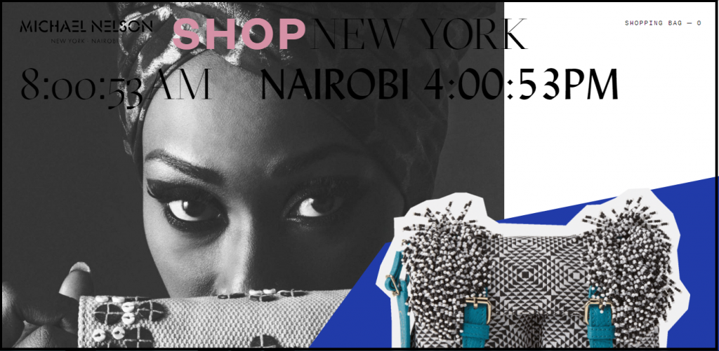 So the above shared screenshot is of the homepage of New York’s designer named Michael Nelson. This website sets a good example because here what the web development company has done is that they correlated their design with their bag’s style.Same kind of stripes, texture and boldness has been used. This clearly shows that disrupting a design shouldn’t be freely.It should be controlled by a motive which in this case was to give a glimpse of Michael Nelson’s bags.
Conclusion
We analyzed the future of web designing and went for deep analysis of every important aspect that could possibly effect your business the most.
And while there are so many factors involved we can wrap up with a general rule; keep in mind that at the end of the day what really matters is the Providing the best User Experience.
And creating an upper level of comfort for the consumer exploring your website should be your only aim.
So we discussed everything that could make a difference to your website in 2019. And for each of these techniques there is 100% surety that they are going to be valuable for at least the next 4 years.
Thus I would personally advise you to implement these techniques as soon as you can and rise above your competition. But remember web designing is continuously moving ahead, so you need to keep striving.
It’s Your Turn Now!
I am done talking and it’s your turn now.
Got any Questions for me?
What do you think about the Web designing techniques and tactics I shared above? Let me know which technique did you find the most interesting and you’ll implement the first?
Is there anything that I missed OR you would like to add into this Post?
Either Way let me know about all this by leaving a comment below right now.
I’ll be pleased to respond to every single one of them.
Leave a Reply